Outdated Sidebars.
Cluttered Space.
Color Schemes and Style Guides.
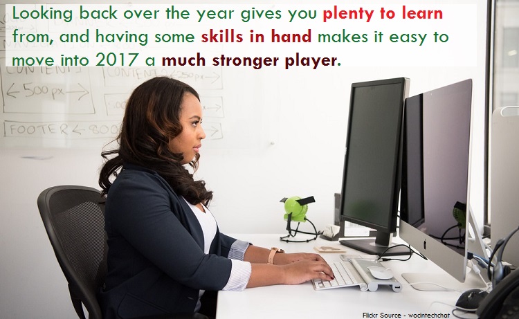
We may be in the final months of 2016, but it’s not time to give up on revamping and refreshing your skills when it comes to web design.
Looking back over the year gives you plenty to learn from, and having some skills in hand makes it easy to move into 2017 a much stronger player.
-
Table of Contents
Responsive Designs Only
Mobile has at the very least caught up to desktop when it comes to websites, if not surpassed it completely. That means that choosing a fluid design is no longer something that is optional if you want to satisfy the 50 percent of visitors who arrive at your website through mobile devices.
In fact, it may even be better to choose a mobile first design and put your primary focus on mobile users as that number is growing rapidly.
- Consider Cards
Arranging your website using a card design makes it easier to navigate, cleaner to read and simpler to design. Containing the most important elements to cards also makes you plan carefully and truly think about the user response and actions on your site.
The user experience should always be the first thing we think of, but too often we forget to accommodate the most important people – our customers. Clean, crisp, card design is a great way to refine your focus in this area.
-
Lose the Sidebar

In theory a sidebar is designed improve the user experience on a website. In actuality, however, the sidebar on websites is making your otherwise beautiful website more crowded and even more confusing.
The sidebar has been hijacked by ads, affiliate offers and entirely too many links to be manageable for a visitor, and it really needs to go. Reduce or even remove the sidebar completely to make your site design more user friendly.
- Free the White Space
Clean. Simple. That is your goal for the modern website. If you have not embraced the more simplistic web design make 2016 the year you increase white space and decrease clutter. Remove elements on your site that are too distracting and not particularly beneficial.
Then space out the important components of your site so that there is plenty of empty space to set them off properly. This provides a cleaner, easier to navigate space for users.
-
Design a Style Guide
The large companies have developed their own style guides and you should, too. A style guide is the approved formatting, font and styles for a company.
When you develop one for your websites, you will ensure that all of your sites are consistent company wide. The style guide also helps to reduce the decisions needed for every new site since font, colors, spacing and formatting are already decided.
-
Use a Drafting Process

Sometimes we comfortable with designing website elements and just start coding or filling in content on a template. This can lead to fast results, but they aren’t always the most attractive ones.
A better choice would be to use a drafting process when you write. This will allow you to plan, arrange, organize, consult the style guide and then create. Sure, it might take a few extra minutes, but starting a web design process offline will lead to improved results online.
-
Size 18 or Bust
Larger font isn’t a new thing, but it’s certainly a big thing in 2016. Using a larger font does a few great things for your site. It improves readability. It encourages you to use fewer words for simplicity sake. It looks better on mobile devices.
Make your text at least a size 18. Then use even larger fonts for headers and subheaders. The resulting site will be much more navigable and reader-friendly.
-
Simplify Navigation

Remember the site trees we used to obsess over? Hopefully you’re still obsessing about yours, but this time with an effort to streamline and reduce the clutter. If you have too many links to too many other pages in your content, you aren’t helping your reader stay on the site. You’re confusing them.
Offering fewer choices to new destinations can actually boost audience interaction with your material. There is definitely such a thing as too many choices. Give them a few choices and make them natural ones that interested readers would like.
- Improve Simple Graphics
If you’ve been grabbing free stock images, it’s time to stop. Make 2016 the year that you replaced tired, overused free graphics with images you either create yourself or those you actually have to pay for.
When you consider that images can cost as little as a dollar or two, it makes sense to invest ten dollars per website to bring in fresh pictures that your readers haven’t already seen on twenty other websites in your field.
- Images, Images, Images
Speaking of images, do you have enough of them? As 2016 marches into 2017, look again at your use of graphics. You should be thinking about using larger, more impressive images on your website.
Readers love images and they are drawn to images and even videos on websites more than they are drawn to text. That means you need to give the readers what they want and include more images, better images, ideally paid-for images.
-
Reduce Sliding Distractions

If you’re still using sliders on your website consider removing the slider in favor of a large static image. Why? Because the sliders create distractions and too many choices for readers.
Readers aren’t particularly interested in navigating the sliders you have on your website. They see something interested and want to check it out, but now they are clicking through arrows trying to find the right spot to read. In the interest of user patience, ditch the sliders and go with static images. The simpler design you’ll create can be considered a great bonus.
A new year is quickly approaching. Don’t you want to start 2017 with new, shiny websites? If so, this is the sweet spot of 2016 – a time to learn from what’s come before us and prepare for what is to come!
Donna Merrill
Hi Oleg,
Nice post here about web design.
I totally agree that simplicity is sweet, distraction is disaster and sliders are a silly way to drive your visitors nuts.
It’s okay to modify your sites… to a degree. But a total overhaul just could be in your best interest and the New Year approaching is always a time to consider taking your business in a new direction.
-Donna
Oleg Calugher
Hi Donna,
Thank you for the comment,
Yeah, 2017 is fast approaching. Simplicity will always be the primary thing in design, too much of distraction is bad for sales, leads and user engagement.
Thanks,
– Oleg
Ravi Chahar
Hey Oleg,
For a perfect web design, you must have a rough sketch on a paper. Ask your clients to do the changes.
Responsiveness is required. Take care of every screen size available in today’s era. Even iPhones are of different screen sizes.
You brought a good point here. Removing the sidebars can be really good to provide more space to your users.
Great post indeed.
~Ravi
Oleg Calugher
Hi Ravi,
thank you for the comment,
Totally agree with you about the sketch, the basic mock-up of the design is crucial – that is how you get the idea about what your client wants.
Yeah, the sidebar does take up a lot of space and in most blogs it stays unused mostly.
thanks,
– Oleg
Aigen
Hello Oleg,
Good post with good info. I’ve notivced lots of websites are increasing their sizes to 16, 18. Do you think it’s a good improvement even if scrolling is more and more necessary?
Thank you!
Oleg Calugher
Hi Aigen,
Welcome to Temok and thank you for the comment,
Yeah, bigger font sizes are always good, that improves readability. Scrolling could be a downside, but atleast it is good for the eyes.
thanks,
– Oleg
Sanu Siddharth
HI Oleg,
First of all i want to say thanks for this amazing post , you totally changed the view of web designing in 2017 this is really impressive and Search engine friendly.
Yes! in recent update Google also announced if website is mobile friendly then they will give it more preference .
So many new updates and knowledge has been shared by you by this post.
Thanks for Sharing 🙂
Oleg Calugher
Hi Sanu,
welcome to Temok and thank you for the comment,
Good to know that you found the post useful,
Yeah, Mobile friendly is the biggest requirement today, with the percentage of mobile users going as high as 80% … there is simply no way to ignore it.
thanks,
– Oleg
Lisa Sicard
Oleg, I do like the look like of the new cleaner sites without much on the sidebars. I did change mine a few months back but I may make it more simplier too. I definatey agree on the font type, I came across a post that I read a headline on social and when I got to the site the typeface was too small too read, I didn’t stick around 🙁
Thanks for tips to improve our websites Oleg!
Oleg Calugher
Hi Lisa,
thank you for the comment,
On a cell phone device, the sidebars do look bad but on desktops – people still have a mixed opinion about it. With the cell phone audience going as high as 80% and beyond, one really needs to think about their targeted audience and plan the design accordingly.
Totally agree with the fontsize, if they are too small – it becomes impossible to read. On a mobile device, it becomes even more difficult,
thanks,
– Oleg
LH Louis
Definitely love this post. Responsive design is the most important element to attract people.
Oleg Calugher
Hi LH Louis,
thank you for the comment,
Yeah, cell phone friendly design is the best thing to do right now for catching and keeping more visitors for a website,
thanks,
– Oleg
Emebu
Hi Oleg,
This is a very nice post here about website design.
Like you right;y stated, “simplicity is sweet while distraction is a disaster.
I have come to discover that sliders are killer way to drive your visitors crazy.
Oleg Calugher
Hi Emebu,
Thank you for the comment,
Good to know that you liked the post,
Surely, sliders aren’t helping – it is best to have a simple and clean layout with minimum distraction,
thanks,
– Oleg
Anyinature Damasta
I love this post Man.
Aftr Reading this post, I gathered More Knowledge On Web designing.
I will surely stop by Again
Joy Healey
Hi Oleg,
Must admit I like the idea of increasing the font size of my blog. I’ll certainly have a think about that one – and hope plenty of other people do too!
Sadly the menus and structures of my blog have chopped and changed rather, and probably time for a review of those too.
Quite worrying to be thinking about plans for 2017 already. Can’t imagine where 2016 went! But thanks for the warning, with tips on how to improve my blog layout.
Joy – Blogging After Dark
Oleg Calugher
Hi Joy,
thank you for the comment,
Yeah, we are already towards the end of 2016 and looking back, it seems like the whole year went away pretty quicky.
Font size should be bigger, smaller fonts are impossible to read – both on the smaller screens and on the desktops.
Thanks,
– Oleg
Babanature
Hello Oleg,
What a nice post for every bloggers to read and digest. A blog that is responsive and fast should be the first thing a blogger should put in mind when creating a blog.
Your tips are valid and should be taken seriously.
Have a joyful weekend
Oleg Calugher
Hi Babanature,
Thank you for the comment,
Good to know that you liked the post,
Yeah, with over 80%+ traffic coming from cell phone devices, one should totally go responsive and speed up their loading times too,
thanks,
– Oleg
Kim
Hello
I guess for a great web design, we must use rough sketch of that website on a paper and you can ask your clients to do the changes. Secondly Responsiveness is very important for a website. Take care of every screen size available in today You gave a great point here that removing the sidebars can be really good to provide more space to your users.
Regards..
Kim
Testing Teacher
This post really helps me to get the best out of from a perfect web designing website. The way you have described the design and style guide. It really matters for a new web developer like me… Thanks for sharing… Your article is really beneficial for me…
Usman
I think responsiveness and speed of the website is the most important point. No matter how great your website looks. If its loading time is slow, you will get much lesser traffic. And traffic is what we all crave for.
Crazy Tom
Hello Oleg,
Wonderful article below with regards to web page design. My spouse and i absolutely acknowledge that will straightforwardness can be special, distraction can be problem along with sliders can be a absurd approach to travel them insane. It’s fine to change your current sites… to your amount. Nevertheless an overall renovate only may be as part of your ideal awareness plus the Brand-new Calendar year drawing near is actually a moment to take into consideration having your small business in a very brand-new route.
twap
This article is very helpful. Guess I need to re-design my website 😛
Keep writing,
Twap
Oleg Calugher
Hey Twap,
Thank you for the comment. Do let us know your name so that we can attribute you better. Do consider a gravatar too.
Good to know you found the article helpful and looking forward to your re-design,
thanks,
– Oleg
Joseph Chikeleze
This is the fact of what plays well in web design 2016. A clean and responsive design works best.
I increased my ctr and SEO by going for the most simple design ever. Thanks and do have a nice day
Vayam
Hi Oleg,
Nice article. It is important to revamp or refresh the site time to time. In today’s era, sleek, classy designs are preferred. People love to see new things, designs etc. An attractive design can increase the no. of visitors. With the new look, the content also must be informative.
Jelina Roy
Hey Oleg
Thanks for the Great Tips !
I agree with the tips you have given in this post, although, I believe Sidebar is still very important and must have thing for our blogs, but we need to keep things simple, a simple blog with easy reading is enough these days.
BTW, keep up the good work.
~ Jelina
Emenike Emmanuel
Hi Oleg,
I agree with you. Simplicity is key. Complex web design will always result in high bounce rate. And you know what, Google frowns at websites if high bounce rate. Bloggers must understand that there’s beauty is in simplicity.
Thanks for sharing this Oleg.
Oleg Calugher
Hey Emenike,
welcome to Temok and thank you for the comment,
Yeah, keeping things minimal is always better – like they say, less is more.
thanks,
– Oleg
Pingback:
Lawrence
Well responsive design is very important for all the websites/blogs because there’s bee a tremendous growth in mobile users.
These tips are of great help!
Oleg Calugher
Hey Lawrence,
Thank you for the comment
Yeah, the mobile growth that had happened in the past decade is totally unprecedented. And with time, more people will shift to mobile browsing – which makes responsive design an absolute must have.
thanks,
– Oleg
shane williams
Responsive website design is very important when it comes to build effective website for any business. Its cool information.
Oleg Calugher
Hey Shane,
Welcome to Temok and thank you for the comment,
Yeah, Responsive design is a must have for any business.
thanks,
– Oleg
Adam
Hi,
I too believe the same as you listed in the post. Most of the old tactics have been outdated so we need to try new trends.
Thanks
Oleg Calugher
Hey Adam,
Welcome to Temok and thank you for the comment,
Yeah, one needs to stay updated with the trends and keep the design and content fresh,
thanks,
– Oleg
Joseph Chikeleze
This post is still appealing to me. I still have to remind myself of the awesome traits every good web design must have.
Thanks
Dev
i think google or any search engine for that matters opt out for user experience and the first thing that comes on this category is the websites responsiveness.
Oleg Kaluger
Hey Dev,
Welcome to Temok and thank you for the comment,
Would suggest you to get a Gravatar and a real name for the name field, that way I can address you better,
agreed completely with your point, cell phone responsiveness is a top priority now, and in time it will become even more important,
thanks,
– Oleg
Manuel
Hi, Oleg what a great explain . But i want to add one thing extra in web design in 2018 React native is most popular in 2018